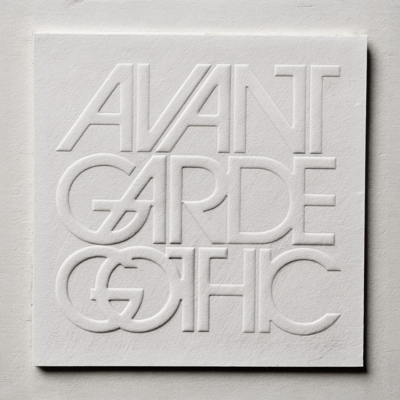
It sounds
the way it's set
Herb Lubalin did not draw letters, he made them speak. A New Yorker, an art director before he was a typographer, in the sixties and seventies he transformed American typography from a service into a protagonist. His most famous mark, Mother and Child, places a child inside the O of Mother, and the word becomes its own meaning.
For him, type did not dress the message, it was the message. A typeface is already a tone of voice, before the brain even reads, it whispers or shouts, reassures or challenges, is ancient or is tomorrow. Choosing a typeface is choosing how you sound.
Today typography lives almost entirely on screen and the rules have changed, a headline must be read on a six-inch display, a logo must hold from a watch to a shop sign, variable fonts change weight in real time like a voice modulating as it speaks.
And yet how many identities are still born by picking a system font out of laziness, and speak with anyone's voice. The text says trust, the typeface says banality, and the typeface always wins. I wonder how many brands we would recognise from the typography alone, without logo and without name, which is, in the end, the real proof that the voice exists.