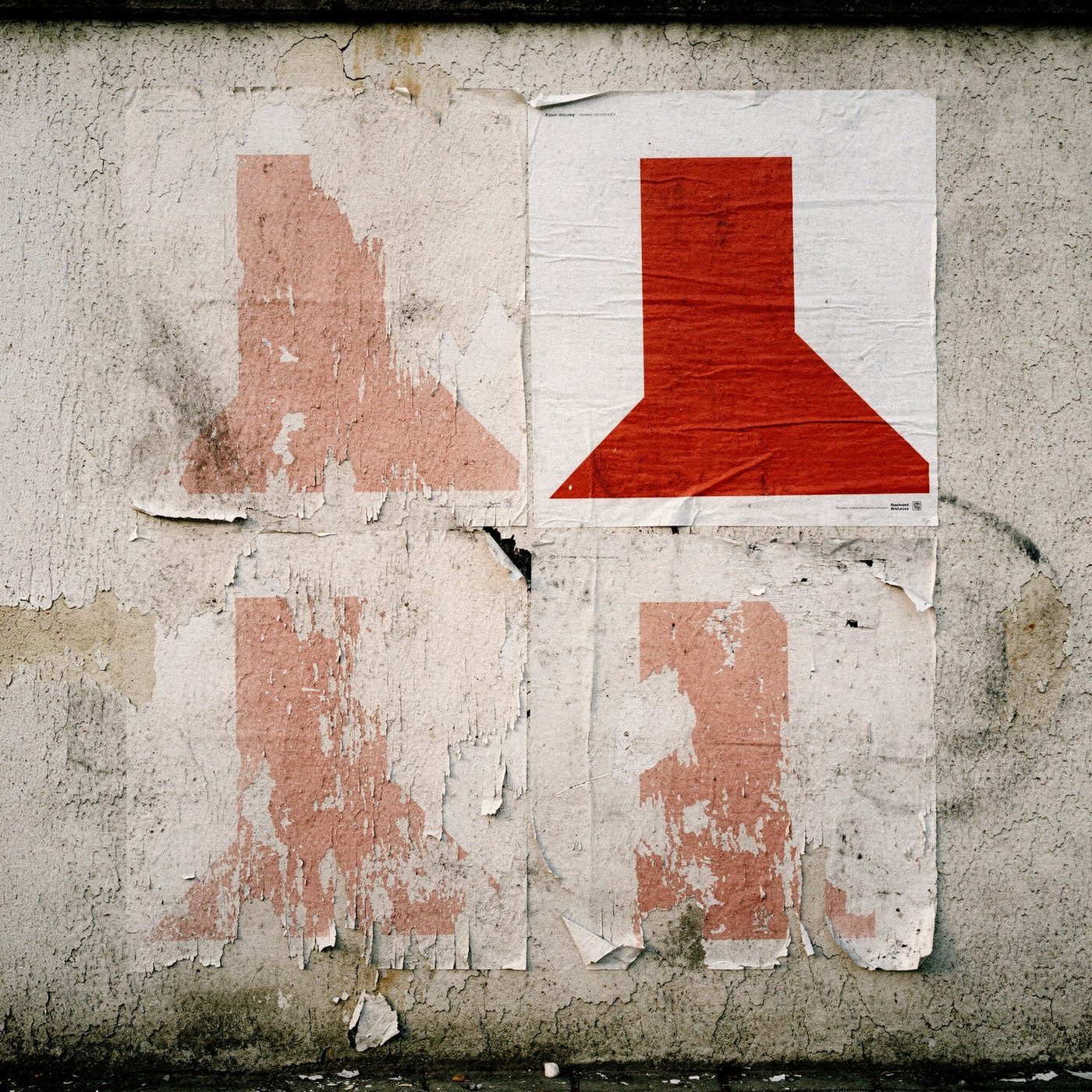
Always the same,
thankfully
Massimo Vignelli used six typefaces in all, and said even those were too many. A Milanese transplanted to New York, he designed the subway map and the American Airlines identity, which stayed unchanged for forty years. His idea was simple: consistency is not repetition, it is recognisability. A brand that repeats the same signs settles into memory without asking permission; one that keeps changing its language starts from zero every time.
Today the principle is even truer and even harder. A brand lives as an app icon, avatar, story, thumbnail, favicon, and the eye crosses it dozens of times a day in tiny formats Vignelli never had to face. Feeds reward constant novelty, algorithms demand ever-different content, and constant novelty is exactly what erases an identity. The whole tension is there: change enough to stay alive, repeat enough to stay recognisable.
And here a particular care is needed, because in the frenzy of rebranding, in the name of some phantom repositioning, paths that had a personality of their own are abandoned for choices that are nothing more than typographic compositions, where the font of the moment is supposed to do the job on its own. A fashionable typeface is not an identity, it is a rented suit, and it shows. The interfaces we use every day without thinking: those are the identities that won.
And if change becomes necessary, because sometimes it is, it must carry with it elements of recognisability equal in strength to those it wants to renew. Otherwise it is not an evolution, it is a trick of the eye. I wonder how many brands would survive reduced to a sixty-pixel square, the ultimate test that decides everything today.